
Beaba
Bringing Beaba's Mission to Mobile: An Interactive Tool for Cancer Education
Beaba is an organization in Brazil that uses technology to demystify cancer for children and parents. My role was to lead the integration of Beabook, Beaba's physical cancer guide containing 200+ terms related to cancer, into a mobile app to help 32,000+ cancer patients and families worldwide feel more informed and empowered during their cancer journeys.
ROLE
Product Designer
TEAM
4 Designers, 1 Design Manager, 1 PM
TIMELINE
Oct 2023 – Nov 2023
TOOLS
Figma, Figjam, Miro

The current physical, dictionary-like format of the book poses major limitations for engagement, especially for children. If users aren’t engaged with the content, their capacity to learn from it will be constrained. Physical book distribution is also limited.

How might we integrate Beabook into a mobile app that is both engaging and informative?
TARGET USERS & GOALS


PARENT & CHILD USER INTERVIEWS
I interviewed a total of 7 users: 5 children (ages 5-11) and 2 parents. The goal of the interviews was to understand how kids learn from and enjoy interactive media and how parents like to educate their children about health, especially while discussing sensitive topics.
Affinity Mapping & Key Findings


COMPETITIVE ANALYSIS
Building on insights from my interviews, I conducted a competitive analysis of five competitors, focusing on key aspects of rewards and customization, collaboration, gamification, and information balance.

My competitive analysis:
Inspired engagement strategies including rewards, streaks, reading progress, reminders, and interactive social elements
Helped me start ideation for navigation components (what are the affordances of an online book? How do we keep younger users in mind?)
Motivated our final book organization (e.g. searchable index, filter by topic)
STORYBOARDS & PERSONAS
I developed a set of personas to better empathize with our multiple user groups and systematically capture users’ goals, frustrations, and backgrounds. This process helped identify and distinguish key use cases shown in our storyboards, ensuring our final designs addressed specific user scenarios.

IDEATION
Based on research insights, I conducted two rounds of paper sketching, focusing on gamification elements, book organization, and navigation. Through ideating, I learned how important it is to share (visual) ideas with the team early and often, as it helps identify misalignments before progressing further.

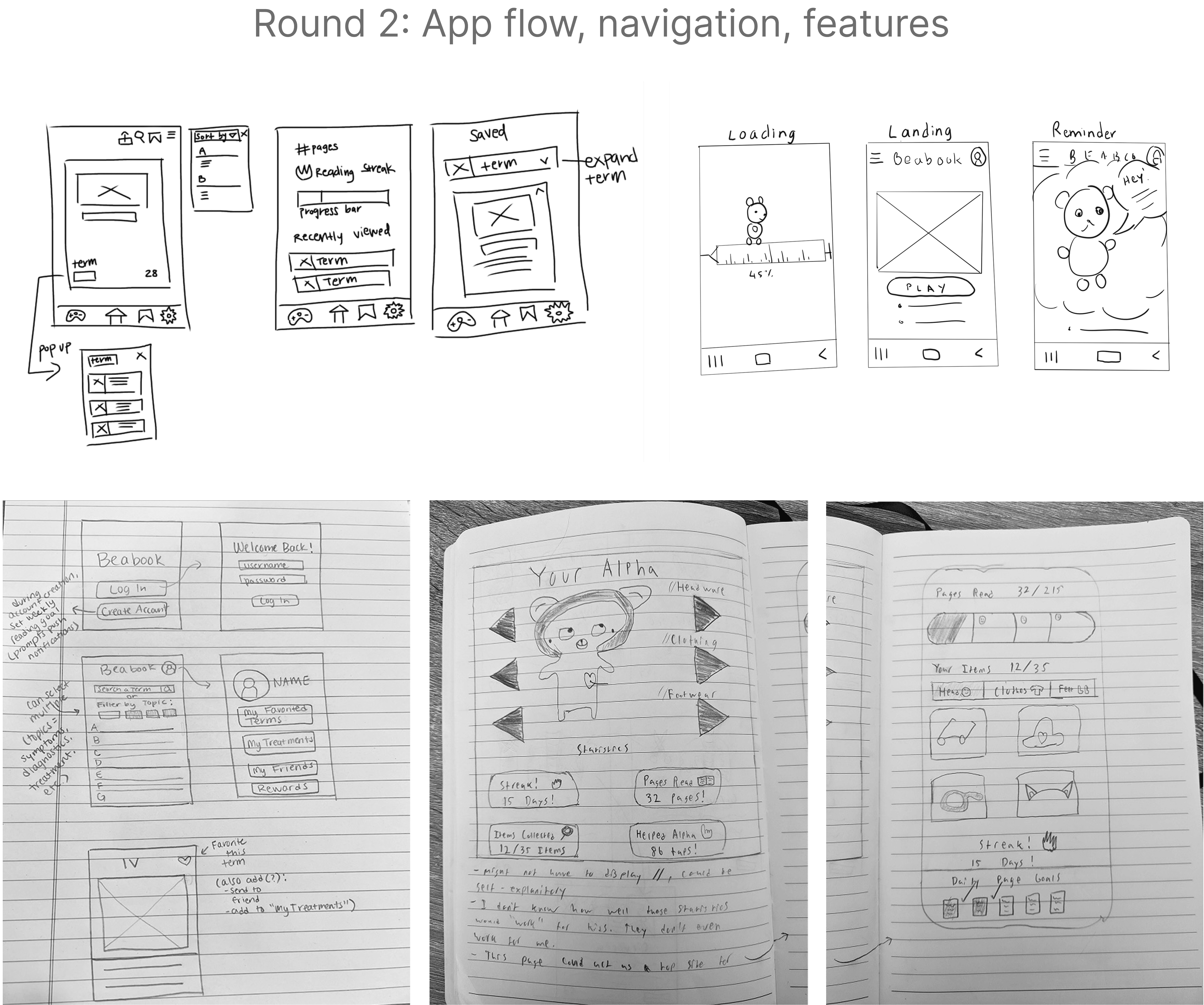
WIREFRAMING & LO-FI PROTOTYPING
Next, I created wireframes and low-fidelity prototypes to define and test how we wanted the navigation, features, and flow to look and feel.

I tested our lo-fi prototype with 7 users. A few designs I iterated on based on usability testing insights include:
PAGE FLIP INTERACTION
I wanted the page flipping to mimic flipping pages in a physical book but needed to make the motion intuitive for kids and adults across cultures – because although Beaba is based in Brazil, they distribute their products to patients worldwide.

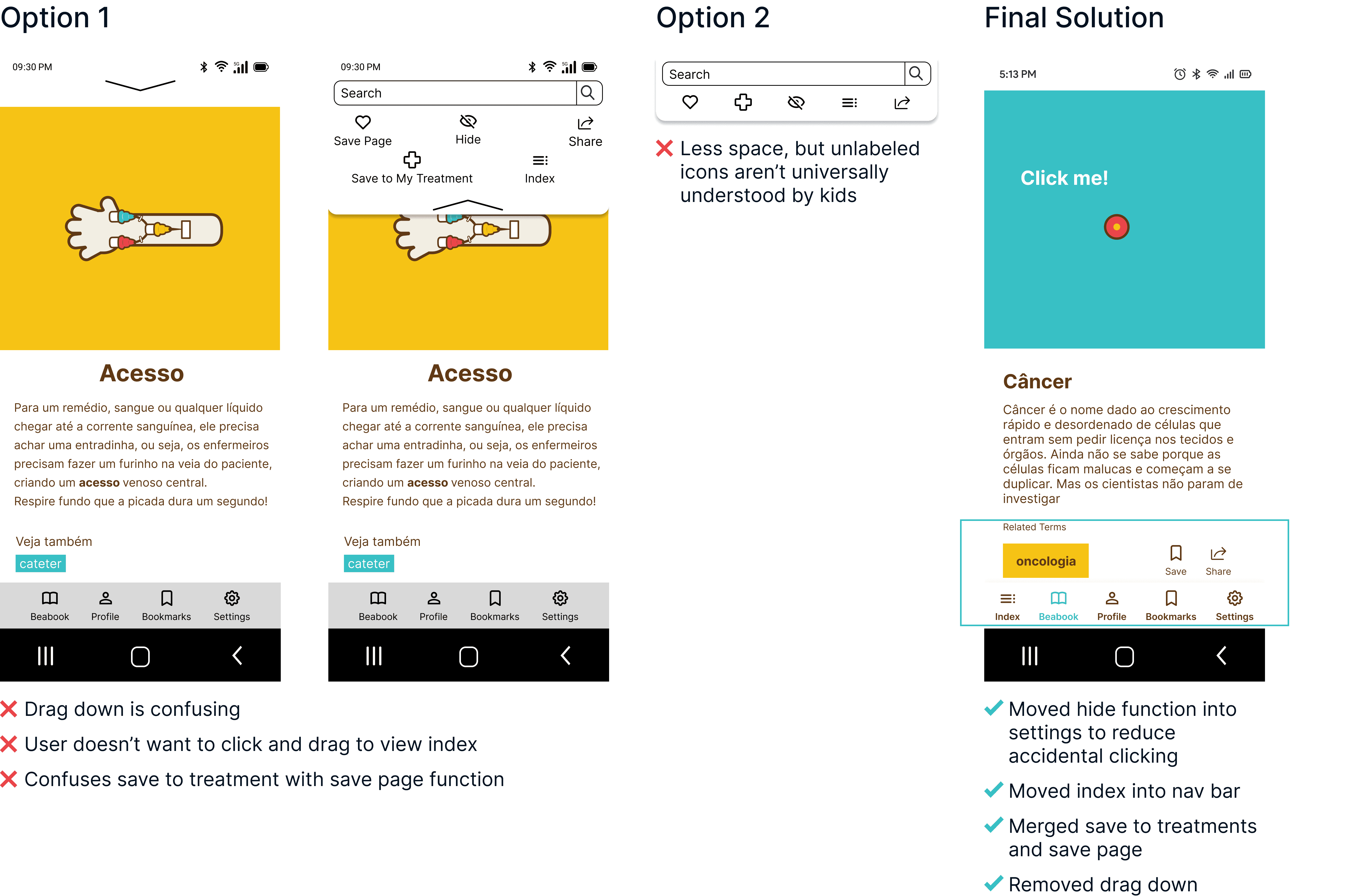
FUNCTION ORGANIZATION & CATEGORIZATION
I wanted to find the best way to categorize and place information – starting with deciding what would be considered book functions vs. broader app-level functions. From user research, I knew functions like saving and sharing were essential to a book.
I merged the “save to treatment” and “save page” actions into one consolidated save function, since users didn’t significantly distinguish between the two. The “hide” feature was removed from the book page – kids accidentally tapped it during testing – so it now lives safely in parental settings.
I also realized the index needed to function as a global navigation tool: users wanted to jump to a new term or topic from anywhere in the app, not just within a specific page. So I elevated it from a book-level control to an app-level one and moved it into the bottom nav, making the index more discoverable and aligned with how users naturally group navigation features.

BY THE NUMBERS
85% increase in learning engagement 32,000 patients benefited 20% increase in donations to fund future initiatives
The learning that sticks with me most is the importance of positive cross-functional collaboration. I’m grateful to have worked with a wonderful team at Beaba, who provided us with precise and thoughtful feedback during every phase and challenged us to think outside the box. As the Beaba team consisted of cross-functional members, I gained a deeper appreciation for the value of interdisciplinary collaboration. For example, from the design team, we got great feedback on UX/UI elements such as increasing intuitiveness, reducing cognitive burdens, and matching mental models. Meanwhile, input from psychologists allowed us to better understand how our designs affect users mentally and emotionally.
Being exposed to these diverse perspectives allowed me to examine my design decisions from different angles, attaining the depth and breadth necessary to understand the holistic impact of our design, which I believe ultimately leads to more robust, sustainable solutions.

Thank you to my team!